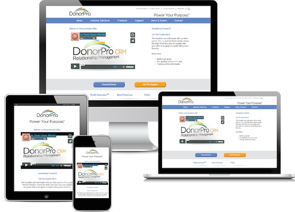
image: DonorPro
Over the last few years, we’ve watched as smartphone ownership has grown leaps and bounds. Super Monitoring reported that nearly 60% of people on earth have smartphones, up from 35% just three years ago. In much the same way, tablet usage has skyrocketed globally. Over 500 million tablets were shipped worldwide in 2013. The stats are undeniable, but on a scale so large, they can seem intangible or abstract.
For years, nonprofit publications have been writing about the need for nonprofits to “take advantage of mobile” or “leverage mobile.” In a country where 40% of all web traffic comes from mobile phones and tablets, every organization must devise a strategy to meet this rapidly increasing behavioral change. Understandably, many community-based nonprofits are still finding it difficult to take practical, actionable steps towards this end due to lack of resources and the mystifying nature of the exploding mobile world.
It’s easier than you think
Here’s our advice: Don’t get tripped up by thinking that “going mobile” means building an app, running mobile ads, and hiring a new employee to run digital marketing all at once. It’s not that difficult.
From a fundraising perspective your nonprofit website needs to do four basic things:
- Build Cause-Awareness
- Facilitate Further Engagement
- Drive Online Donations
- Encourage Volunteer Participation
From a user experience standpoint, your website should greet your demographically diverse web visitors with a friendly, easily navigable journey on all three main computing devices:
- Desktop (Including Laptops)
- Tablet (Including iPad, Surface, Nexus, Galaxy Note, Kindle etc…)
- Mobile (Including iPhone, Galaxy, Droid, HTC One etc…)
Size Matters
As you surely know, the screen size is different depending on which device you are using to accessing the Internet. Desktop is larger than tablet and generally more square, while tablets are larger but have a surface area of similar proportion to mobile. Based on these differences, navigating a website designed solely for desktop from your mobile phone can be extremely difficult, frustrating and unfulfilling for you and your visitor. These devices provide unique “experiences” for visitors and at the same time a great opportunity for you.
Leverage the Opportunity – be Responsive to Users Needs
A website developed to automatically adjust and optimize based on the size of the screen is called Responsive Web Design. It doesn’t mean you need three separate websites built, it just means your next website needs to be coded properly to present itself in a responsive way no matter the device your visitors use to access it.
Test for Responsiveness
Here’s a way you can tell if a website you’re visiting on your desktop browser is responsively designed. With your Internet browser (Chrome, Safari, Firefox, Internet Explorer) maximized to take up the whole desktop screen, move your mouse over to the right side of the browser until you see this arrow (<->). Click and slowly drag your mouse to the left, reducing the width of the window. You should see the browser change shape, and most likely the content on the screen will move and optimize itself automatically to fit inside the smaller and smaller size. Some websites are designed to fit desktop, two different sizes of tablet, and two different sizes of mobile phone.
The Importance is Undeniable
To fully understand the importance of responsive design, put yourself in the place of your targeted prospect segments – young and old – female and male – computer savvy and not so much. Imagine that your site is responsive, accessible from anywhere and prospects can easily move from the Awareness stage to a Volunteering or Giving stage. This process is called “conversion”. It’s where we facilitate movement from getting information to “taking action”.
As an example, let’s say each prospect spends twenty minutes at lunch browsing the web on any of the three device categories mentioned earlier. During their time online they seen article mentioning your nonprofit that was of interest. They briefly visit your website, just long enough to sign-up for your mailing list. During the commute home on the metro several hours later, they check their email on their smartphone and open a note from your organization requesting volunteers for an upcoming event. They click the link in the email, which takes them to a landing page you’ve built for potential volunteers. At home, they mention the volunteer opportunity to their significant other and after dinner they browse your website again… this time on their iPad. Unfortunately, they are booked the day of the event and can’t volunteer, but they’re feeling generous. They click the Donate Now button and contribute $100 to your cause! A conversion occurred, a donation received and a new donor is now in the fold and can be further cultivated and engaged.
Bob Weitz (Co-Founder) and Dylan Tran (Director) of Fahrenheit Studio, an award winning branding and design studio in LA, commented on the importance of responsive web design to the fabric of an organization in this way. “We advocate that brands be “responsive” to their communities, so the user experience needs to adapt not only to the way customers move through the site, but to their emotional and cultural needs as well. The fact that a site adapts to any device sends the powerful message that this brand is made ‘just for you.’ “
What’s Your Next Step?
If you’ve yet to move to a responsive designed site, your next step should be this: Find several thousand dollars in your budget and hire a web developer as soon as possible. The investment will pale in comparison to the donations you can generate with a responsive site experience. There are web designers who would love the opportunity to do good by helping your nonprofit.
The transition from desktop to mobile is even more dramatic than the shift from offline to online fundraising. In both cases, don’t completely ignore one for the sake of the other. Each medium plays an important role in development. When properly integrated, your fundraising results will be astonishing!
Don’t delay the transition to Responsive Web Design for desktop/tablet/mobile-friendly browsing. The time to act is now!
Dan Quirk Marketing Specialist DonorPro | Nonprofit Fundraising Solutions [email protected] | www.donorpro.com 2014 NTC Booth: 608
